Our covers
Every cover starts with a look at what's selling in your category right now. Hover or tap a cover to see the thinking behind it.
Published covers
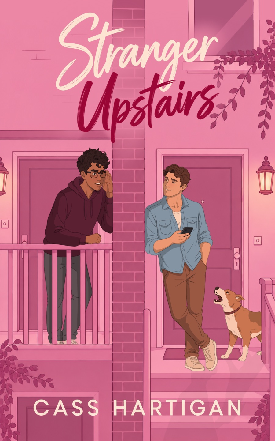
Illustrated rom-com style: one bold colour, a hand-lettered title, and two characters (plus a dog) that tell you the premise at thumbnail size.
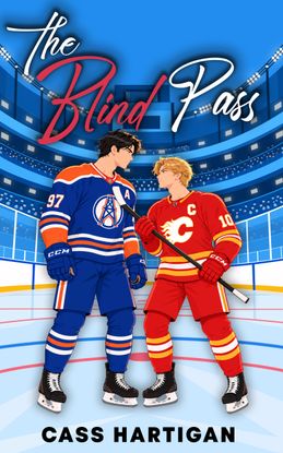
Rival jerseys at centre ice and a script title. Sports-romance readers know exactly what they're getting before they read a word.
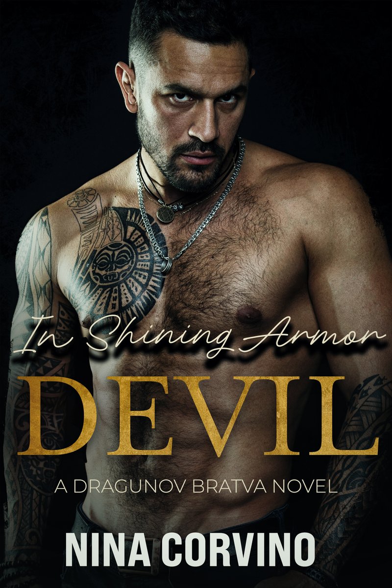
A dark ground, a single figure and a gold serif title: the visual language dark mafia romance readers scan for.
Cover concepts
Sample directions across other genres, to show the range. These aren't real titles.
A warm gradient and soft circle read as sunset from across a room — the genre signal romance readers scan for on a shelf or a thumbnail.
Black background, one hard red line, tight sans type. Thriller covers sell on contrast and unease, not detail.
A map-frame border and a single star signal 'world to explore' before a reader has read the title.
Muted paper tones and one quiet illustrated object — memoir covers undersell rather than shout.
An upward bar chart and confident yellow — business readers expect a promise of growth, stated plainly.
Want a cover like this?
Every cover is designed for your genre and read against what's currently selling in your category.